
About Me
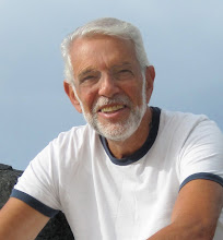
- Guy Corriero
- I was born and raised in Brooklyn, N.Y. My educational history is as follows: Long Beach High School, School of Visual Arts, C.W.Post College, M.A. in Humanities, Hofstra University. A two year stint in the U.S.Marine Corps as a illustrator eased my entrance into civilian life as a commercial artist in N.Y.C. My teaching career of twenty five years began at the State University in Farmingdale, N.Y. and ended as a Professor of Fine Arts at Herkimer County Community College, where I was awarded The New York State Chancellor's Award for Excellence in Teaching. I now paint full time in Portland Maine where I live with my wife Sharon. I paint all subjects from portraits to landscapes but I especially love painting the sea. Last year marked the end of forty straight years of teaching workshops on Monhegan Island, Maine, I now conduct three day classes in Kennebunkport every spring and fall. My work can be seen at The Wiscasset Bay Gallery, Wiscasset, Me., Dowling Walsh Gallery, Rockland, Me.,Camden Falls Gallery, Caamden, Me. and here in my studio in Portland. I am a signature member of The American Watercolor Society and the New York State Watercolor Society.
Wednesday, November 16, 2011
Saturday, August 13, 2011
Rocks And Sea at Prouts Neck

I made up the sea around the rocks as the ocean was very calm on that particular day.
It's a rather large painting at 24x36 oil on linen stretched canvas.
October Snow

Everything in the scene is exactly as it was in nature, however I invented the stream.
The painting was done on a 18x24 oil primed linen canvas board.
Friday, July 15, 2011
Step 1, Jewel's Falls,

I did the sketch with ultramarine blue and transparent red oxide.
Step 2, Jewel's Falls

Final Painting

Wednesday, July 6, 2011
Approaching Storm In Mexico

Western Wind

Surf At Two Lights State Park, Cape Elizabeth, Maine

I'm still not sure about the "pinching" effect of the two rock forms meeting at the right center. I think I'll fix that too now that I mentioned it.
Surf Below White Head

Did anyone notice that?
Oh yes! Another note: The painting is on heavy rough 300 lb. Arches paper.
Rising Tide At Lobster Cove

One of the pros is the fact that you can lift the paint a bit, just a bit. The con side is you loose control of the paint more easily as it doesn't have the tooth of my usual 140 lb cold press paper.
I started with the sky and work forward, painting the dark rocks last designing them to move the eye back towards the breaking wave.
Heavy Seas

The painting was done in the studio. The preliminary sketch in pencil came first then I worked from the sky forward. As you can see the sky set the color scheme for the entire painting.

Once again I had to capture the cast shadows on the beach quickly as the sun seems to move faster in the morning. (of course it doesn't) but the early morning light had to be captured fast. .


The light on the ground was extreme because they put down some straw to get the grass seed going.
Painting like this is always a challenge as the sun moves quickly and therefore changes the entire subject.
The subject is the Old Black Duck fish house on Monhegan Island, Maine.

Friday, May 27, 2011

The colbalt blue touches in the foreground water are much more subtle in the painting but the digital camera pulls them out way beyond the desired effect. In any case, you get the idea.

The palette knife came in handy in this painting as well. The reds behind the rock are not as red as they are in the photo.

Monday, April 11, 2011
Winter of 2011, Portland, Maine

The painting was done in the studio after making several pencil sketches to get a good design of values.
It's a 16x20 oil on linen canvas board.

I hiked a long way into Cathedral Woods on Monheagan unit I came to the base of Whitehead, the tallest cliff on Monhegan.
I tried, and I think sucessfully, to make a needed focal point at the base of the fallen tree.
The painting is a 16x20 oil on linen panel.

Acadia Fall

Unless your shooting with slide film the color in digital only approximates the true colors unless you shooting in what is called RAW, which requires a very expensive photoshop program. In any case you get an idea of what the actual painting looks like.
Tide Pool Play

Thee is very little exaggeration of color in the tide pool as it actually comes from a fresh water spring near the beach and is filled with iron residue.
Monday, January 31, 2011
Swim Beach, Monhegan Island

This one worked. A few months after it was done I added the red boat to improve the composition and color distribution of the reds.
Maine Coast

Special attention was paid to the harmony of warm colors consistant throughout the paintng as well as the direction of light from the left.
It's painted on a 24x30 piece of masonite that was coated with about six thin coats of acrylic gesso.
Saturday, January 29, 2011
My friend Bruce Schwabach has a very athletic son with fairly defined muscles. We walked down Steel's Creek in Ilion, N.Y. and I had him strike this pose, along with many others.
What excited me most about the subject were the various colors and the light moving across his back with his head and face receiving reflected light from the water.
The painting was done on 24x30 oil primed stretched canvas beginning with a warm wash of yellow ochre and transparent red oxide.

Finishing up with the last touches of dark watercolor I couldn't wait to get some relief in the shade, when an elderly man came by with an arm full of mesquite wood.
I quickly went for my camera in a motion that was reminiscent of an old cowboy movie and took a photo. I usually ask for permission but I knew it was now or never. Put him in the painting back in the studio
Thursday, January 27, 2011
Wednesday, January 26, 2011
Lobster Cove, Monhegan Island, Maine

Painted with Lobster Cove in mind this was done from memory in the studio in Portland. It's on a piece of 24x30 masonite and is presently in the Dowling Walsh Gallery in Rockland, Maine. I painted the entire board with a wash of yellow ochre and transparent red oxide providing a warm background which I let show through . The oil application is very transparent especially in the rocks and foreground sea. The most opaque areas are the lights of white mixed with yellow. They were the very last strokes of paint laid on top at the very end.
Christmas Cove, Monhegan Island, Maine

Tuesday, January 25, 2011
Mexican Village

This painting was done on the spot outside of a small Mexican village. We would never have made it to this place without my friend Mike Klimo's SUV. We set up and began to paint when all of a sudden we were surrounded by onlookers, most of whom were little kids. They were very quiet and attentive with a few giggles now and then.
The only changes I made from the scene was to take the tile roofs of the "houses" in the foreground and tilt them the opposite way so they would be seen. I knew they were red tiles as I walked around the road before beginning to paint. The painting was done on an 18x24 Arches cold press watercolor block.
Monday, January 24, 2011

After making a careful drawing of the ship I masked the ship in order to paint around it freely. The sky was done by applying clear water then painting the entire area with a warm mixture of winsor yellow and cobalt blue. While this was still wet I went in with the dark color for the clouds. The sea was painted with dark blue watercolor as a base with lighter blues of casein on top for the halftones. The lights on the sea were totally opaque with casein white and a bit of yellow. I then removed the masking from the ship and painted it with pure watercolor except for the light on the sails.
My Son Ted


Saturday, January 22, 2011
My World of Watercolors and Oils
Welcome to my world of watercolor and oil paintings. Having taught hundreds of workshops, a fancy name for classes without grades, I suppose the most common question from my students is which medium do I prefer? My answer is the one I'm presently working with. That answer is often met with awed responses by my students, which of course, my ego mutually responds by it's, hopefully undetected enlargement. No! Seriously, some of my students and colleagues are curious as to how and why I easily change from one to the other since the approach and procedures to each are so different. Frankly, I can't come up with a satisfactory answer except perhaps that, when I started teaching painting in college I would always do a demonstration in the medium being taught at the time. Lecturing to students on how to paint is like teaching sailing in a row boat.
I'm new to blogging, but as I understand it I'll be able to show you many times during the course of a week both watercolor and oil paintings in progress, from the first stroke of paint, in the case of watercolor, on paper and in oils, on canvas or canvas board. It's important to keep in mind that although the processes are quite different the basic principles involved in making a successful and powerful painting are the same. Since I paint in a traditional manner those principles are accurate drawing, following the rules of perspective, design of the subject, attention to simple value patterns and finally color harmony.
I'm new to blogging, but as I understand it I'll be able to show you many times during the course of a week both watercolor and oil paintings in progress, from the first stroke of paint, in the case of watercolor, on paper and in oils, on canvas or canvas board. It's important to keep in mind that although the processes are quite different the basic principles involved in making a successful and powerful painting are the same. Since I paint in a traditional manner those principles are accurate drawing, following the rules of perspective, design of the subject, attention to simple value patterns and finally color harmony.
Subscribe to:
Posts (Atom)